6 Perfect Summer Color Palettes to Refresh Your Brand

Your brand colors don't have to stay the same all year long. I know what you're thinking: "Pat, I just spent months getting my brand colors right, and now you're telling me to change them?" Not exactly. But here's what I've learned after designing websites for creative entrepreneurs: seasonal color refreshes can breathe new life into your brand and attract the exact clients you want to work with this summer.
Your brand colors are psychological triggers that influence buying decisions in ways most business owners never realize.
During summer months, your ideal clients are in a completely different mindset! They're thinking vacation, relaxation, fresh starts, and new adventures. If your website is still sporting those deep winter blues and burgundies, you might be missing out on connecting with potential clients who are ready to invest in themselves.
The real question is: Does your current color palette match the energy your summer clients are craving?
I've noticed that brands using the right summer palette see:
- Higher website engagement (people literally stay longer on colorful, well-designed sites)
- More social media shares and saves
- Increased email list signups
- Better conversion rates on sales pages
But here's my personal take: summer colors work because they make your audience feel something. And feeling something is the first step to buying something.
How to Choose the Right Summer Color Combinations for Your Brand
Ask yourself these questions:
What transformation do you offer? Energy and excitement = warm colors. Calm and clarity = cool colors.
Who's your ideal summer client? A stressed-out executive needs different colors than a creative entrepreneur looking for inspiration.
What's your price point? Luxury services can handle more sophisticated, muted palettes. Mass market often benefits from brighter, more energetic colors.
What action do you want them to take? Urgent actions (like booking a consultation) respond well to warmer, more energetic palettes.
The 6 Summer Color Palettes That Actually Work for Business
Let me save you hours of Pinterest scrolling. Here are the summer color trends that actually work for business, not just Instagram aesthetics. I'm giving you the exact hex codes so you can copy and paste straight into your brand kit.
1. The Bold Modernist: Earth Meets Fire

This sophisticated color palette speaks to the confident creative who isn't afraid to make a statement. Anchored by rich terracotta (#a3441b) and vibrant orange (#ef7402), this earthy-yet-electric combination is tempered by deep olive green (#444a29) and a grounding neutral (#d7dbd5) that keeps the intensity balanced.
Perfect for:
Fashion-forward brands targeting millennials and Gen Z
Creative agencies and studios wanting to convey both professionalism and innovation
Personal brands for entrepreneurs, artists, and thought leaders
This palette embodies the modern renaissance of earthy tones with a contemporary twist. It's for those who appreciate craftsmanship and authenticity but refuse to blend into the background. The combination suggests confidence without arrogance, creativity with substance, and a deep appreciation for both natural beauty and bold self-expression.
2. The Luxe Maximalist: Jewel Tones with Golden Glamour
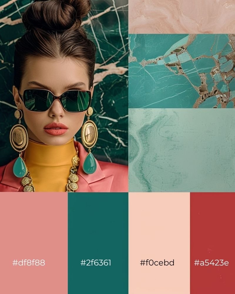
This opulent color palette channels old Hollywood glamour meets modern luxury. The rich emerald green (#2f6361) and deep coral red (#a5423e) create a striking contrast, while soft blush (#df8f88) and warm beige (#f0cebd) add sophisticated balance with golden metallic accents throughout.
Perfect for:
Luxury hospitality and boutique hotels seeking timeless elegance
Premium beauty and cosmetics brands with a vintage-modern aesthetic
Art galleries and cultural institutions with a refined edge
This palette speaks to those who understand that true luxury lies in the details. It's for brands and individuals who appreciate the finer things in life but want their sophistication to feel effortless rather than pretentious. The combination suggests confidence, worldliness, and an appreciation for both heritage craftsmanship and contemporary innovation.
3. The Mindful Minimalist: Serene Nature Harmony

This contemplative color palette draws inspiration from tranquil natural moments and mindful living. The sophisticated combination of soft sage green (#7fa99d), muted lavender (#7d759a), deep navy (#202d48), and gentle pearl gray (#c9d2d0) creates a sense of calm sophistication that feels both grounded and ethereal.
Perfect for:
Wellness and mindfulness brands focused on mental health and self-care
Sustainable lifestyle companies and eco-conscious startups
Spa and retreat centers offering transformative experiences
Yoga studios, meditation apps, and holistic health practitioners
This palette speaks to the modern seeker, those who prioritize inner peace, authentic connections, and intentional living. It's for brands and individuals who understand that true luxury is found in moments of stillness and that beauty exists in simplicity.
4. The Sage & Gold Palette: Sophistication Meets Serenity

This earthy-luxe color palette combines the grounding tranquility of sage green (#5d6a56, #ccc9b8) with the warm opulence of deep forest (#1a2c26) and burnished gold (#b49664), creating a sophisticated color story that speaks to the modern minimalist with elevated taste. The muted greens evoke the calm of eucalyptus and aged herbs, while the rich gold brings luxury without flashiness.
Perfect for:
Sophisticated wellness enthusiast
High-end spa services
Premium skincare lines
This palette beautifully serves premium brands in wellness, beauty, or interior design that want to convey both earthiness and elegance, showing that luxury and nature can coexist harmoniously.
5. The Bold & Beautiful Palette: Electric Energy Meets Confidence
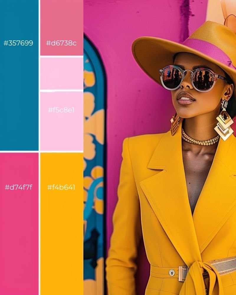
This high-energy color palette combines electric teal with vibrant magenta and sunny golden yellow, creating a fearless color story that screams confidence and creativity. These saturated, unapologetic hues are perfect for making a bold statement – think Miami sunset meets pop art gallery.
Perfect for:
Fashion & Beauty Brands: Stand out in a crowded market with colors that demand attention
Creative Agencies: Show your artistic flair and creative confidence from the first click
Personal Brands & Influencers: Build a recognizable brand that's impossible to ignore
Entertainment & Music: Appeal to audiences who love bold, expressive experiences
This palette appeals to consumers who value fearless self-expression, creative confidence, and high-energy lifestyles. It's perfect for entrepreneurs who want to position themselves as trendsetters rather than followers.
6. The Coastal Escape Palette: Turquoise Dreams & Sandy Shores
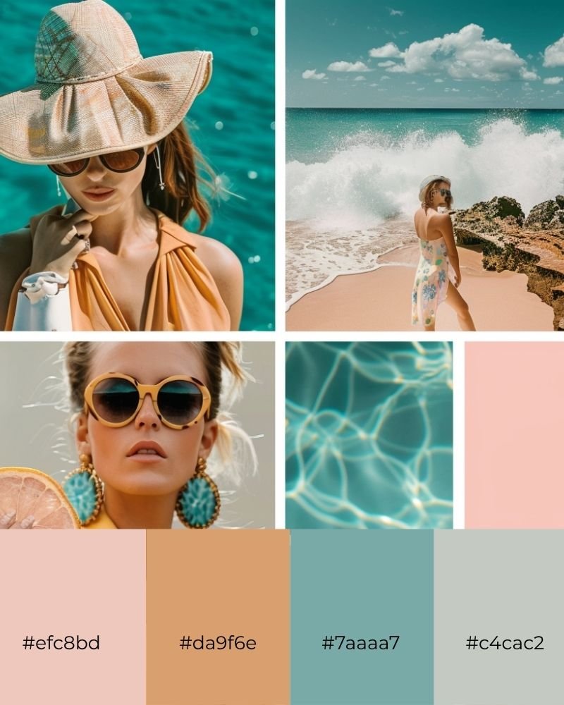
This refreshing color palette blends crystal-clear turquoise with warm peachy corals and soft sage neutrals, creating a serene yet sophisticated color story that whispers of luxury beach escapes. These colors evoke the perfect golden hour by the ocean.
Perfect for:
Travel & Tourism: Transport visitors to their dream destination before they even book
Wellness & Spa Services: Create an instantly calming, rejuvenating atmosphere
Lifestyle Bloggers: Perfect for content creators focused on travel, wellness, and beautiful living
This palette perfectly serves brands targeting luxury lifestyle seekers who prioritize wanderlust, coastal living aesthetics, and curated relaxation experiences.
The Real Talk About Seasonal Branding
Here's what I've learned after years of helping creative entrepreneurs with their websites: seasonal color updates work, but only if they're strategic, not random.
The goal isn't to completely reinvent your brand every three months. It's to keep your visual identity fresh and aligned with your audience's current mindset and needs.
Your brand colors should evolve with your business and your clients' needs

Final Thought
The bottom line: Your brand doesn't have to stay static. Small, strategic updates can keep you connected to your ideal clients and boost your conversions – especially during high-energy seasons like summer.
Ready to give your brand that summer glow? Pick one palette, test it on social media, and see how your audience responds. Sometimes the smallest changes make the biggest difference.
Ready to build an eye-catching website that perfectly captures your ideal customers and represents your brand?
Check out our collections of premium Squarespace Website Templates today and start your journey toward creating an impactful web presence! Click the link below to explore one of our designs.


Just a heads-up: This post may contain affiliate links. That means if you click on one of those shiny links and make a purchase, I might earn a small commission – at no extra cost to you! Think of it as you buying me a coffee ☕for sharing these fantastic finds with you. It helps keep the blog lights on and the content flowing! So, while you’re here, feel free to enjoy the recommendations and know that your support means the world to me.


