Color Psychology in Web Design: A Must-Read Guide for DIYers
Color has serious power in web design. Beyond making your site look good, color influences how people feel, what they think, and whether they take action. In a split second, your palette can tell someone exactly what kind of business you run or push them to click away.
If you're choosing colors based on what "feels cute," let's take it a step further. Let’s talk strategy and discover how to choose color combinations for a website that actually convert.
The Color Psychology
How Color Influences Behavior
Every color sends a specific psychological message to your website visitors. Blue builds trust and reliability, that's why you see it dominating financial and healthcare websites. Red sparks urgency and excitement, making it perfect for call-to-action buttons and sale announcements. Green feels fresh, natural, and grounded, which is why eco-friendly brands and wellness coaches gravitate toward it.
When choosing a website color palette, I always think about what I want someone to feel the moment they land on the site. This emotional first impression can make or break a potential client relationship.
The Science Behind Color and Emotions
Research shows that people make subconscious judgments about products within 90 seconds of initial viewing, and up to 90% of that assessment is based on color alone.
Different colors trigger specific emotional and physiological responses:
Warm colors (reds, oranges, yellows) tend to energize and create urgency. They're perfect for brands that want to convey excitement, passion, or motivation. However, use them sparingly as accent colors to avoid overwhelming your visitors.
Cool colors (blues, greens, purples) promote calm, trust, and professionalism. They work well for service-based businesses, wellness brands, and any company that wants to establish credibility and reliability.
Neutral colors (grays, beiges, whites, blacks) provide balance and sophistication. They're the backbone of most successful website color schemes, allowing other colors to shine while maintaining readability and elegance.
Creating an Emotional Connection
Colors trigger emotional reactions that can be both universal and cultural. The key is choosing colors that align with how you want your audience to feel when they interact with your brand: safe, inspired, motivated, or calm.Want more people to click your buttons? Make them pop with contrast and intentional emotion. A bright orange "Get Started" button on a predominantly blue website creates visual hierarchy and urgency that naturally draws the eye.
This strategic use of color psychology is fundamental to creating good color combinations for websites that guide users naturally through your conversion funnel.
Putting Psychology to Work
I treat each website like a home. The homepage is the welcome mat. The colors need to say, "You're in the right place. Let's get started."
The Role of Color in Brand Recognition and Trust
Color is often the first thing someone remembers about your brand. Studies show that color increases brand recognition by up to 80%. Think about it, you can probably identify Coca-Cola's red, Starbucks' green, or Facebook's blue from a distance without even seeing the logo.
When building your website, choose colors intentionally to reflect your brand personality and values. Use them consistently across your site, social media profiles, email templates, and any other brand touchpoints. This consistency is crucial for creating the best website color palette that builds trust and recognition.
Brands That Get It Right
Squarespace: Their sleek, neutral palette with strategic black and white creates a sophisticated, professional feel that appeals to creative entrepreneurs and small business owners who want to appear established and trustworthy.
Glossier: The millennial pink and clean whites create a modern, feminine, minimalist aesthetic that perfectly captures their target audience's desire for effortless beauty.
Airbnb: Warm coral and soft neutrals create an inviting, friendly atmosphere that makes people feel comfortable booking stays with strangers exactly what their business model requires.
Spotify: Bold green with high-contrast black creates energy and excitement around music discovery, while the dark interface reduces eye strain during long listening sessions.
My Strategic Process for Choosing Website Colors
When I work with clients on their Squarespace template customization, here's my proven process:
Define the brand mood: Is your brand cozy or bold? Soft or edgy? Professional or playful? This foundational decision guides everything else.
Understand your dream client's needs: What do they need to feel to trust you and take action? Security? Excitement? Calm confidence?
Analyze competitor landscapes: Look at what others in your industry are doing, then choose colors that help you stand out while still feeling appropriate for your field.
Create a comprehensive vibe board: Before diving into specific hex codes, I collect inspiration images, textures, and color swatches that capture the overall feeling we're aiming for.
Once you've established your palette, consistency is key. Apply it everywhere from your professional website templates to Instagram stories to email signatures so everything feels cohesive and professional.
Looking for some seasonal inspiration? Check out my blog post on 6 Perfect Summer Color Palettes for website color palette ideas that feel fresh, modern, and full of sunshine.

Accessibility and Contrast
Why Accessibility Matters
If people can’t read your site, they’ll leave. I always check color contrast to make sure text is legible even on mobile, in low light, or for people with visual differences. Web accessibility is crucial for SEO and user experience. Search engines favor websites that are accessible to all users, including those with visual impairments.
Check the Contrast
I use tools like WebAIM's Contrast Checker to make sure my color combinations meet WCAG (Web Content Accessibility Guidelines) standards.
Don’t Rely on Color Alone
When I design, I use icons, underlines, or textures to support color. That way, people who can’t distinguish certain hues can still navigate with ease.
Good Design = Inclusive Design
When I design with accessibility in mind, the whole site works better for everyone.
Color Trends I’m Seeing (and Using)
What’s Trending
Muted, earthy tones: Think sage greens, warm terracottas, and dusty blues. These colors feel grounded and authentic, perfect for wellness brands
70s-inspired bolds: Mustard yellows, burnt oranges, and deep burgundies are making a comeback. When used strategically as accent colors, they add personality without overwhelming the user experience.
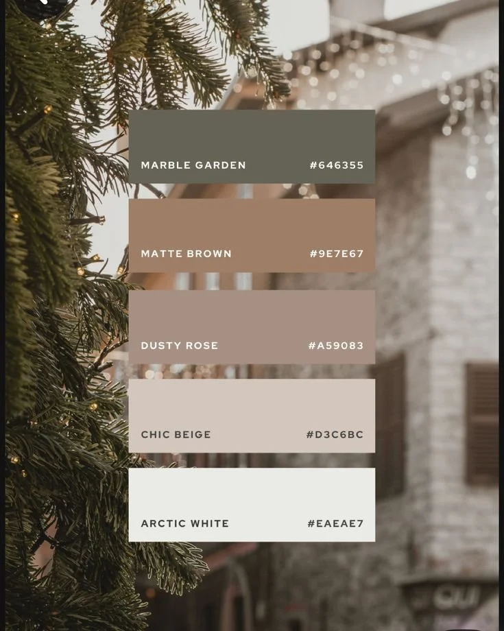
Muted, earthy tones palette (image source from Pinterest)
Soft, layered gradients: Subtle gradient backgrounds create depth and visual interest without competing with your content. They work particularly well for hero sections and call-to-action areas.
Monochrome with one standout color: A neutral base with one standout color creates sophisticated contrast. This approach is perfect for service-based businesses that want to appear professional while still showing personality.

Monochromatic palette (image source from Pinterest)
How I Use Trends Thoughtfully
Trends can help your site feel fresh and current, but I always blend them with solid brand strategy. I won't recommend a trendy color unless it also aligns with your brand values and appeals to your target audience.
Remember: your website should still look great and feel relevant in two to three years. While it's fine to incorporate trending elements, your core brand colors should have staying power.
My Go-To Color Strategy
Understanding Color Theory Fundamentals
Analogous color schemes (colors next to each other on the color wheel) create calm, harmonious feelings. They're perfect for wellness websites, creative portfolios, and any brand that wants to feel cohesive and peaceful.
Complementary color schemes (colors opposite each other on the color wheel) create high-energy, dynamic contrast. Use this approach when you want to grab attention and create excitement, but balance is crucial to avoid visual overwhelm.
Triadic color schemes (three colors evenly spaced on the color wheel) offer vibrant contrast while maintaining harmony. This approach works well for creative brands that want to show personality while staying professional.
Choose your color formula based on the emotional response you want to evoke. This strategic thinking is key to figuring out the best color combinations for websites that connect with your audience and drive conversions.
Tools to Build Your Own Color Palette
My go-to tools for creating stunning website color palettes:
This is one of my go-to tools for quickly generating color schemes. You can lock in a shade you like and let the generator suggest complementary tones. It’s also great for exporting palettes and testing how colors feel together.
If you want something a little more technical, Adobe Color lets you explore color harmony rules (like complementary or triadic) and test accessibility contrast ratios. It’s helpful when you’re working from a color wheel mindset.
Squarespace Template Preview
If you're working on a site redesign, try out your color ideas directly in a Squarespace template. Seeing colors in action with real content and spacing makes a huge difference in how they feel.
If you’re pairing your palette with new typography, make sure your font choices complement the vibe. In case you missed it, I broke down my favorite modern font pairings for Squarespace, which can help round out your overall design style.
Design for Your Audience
Always consider who you're designing for when selecting colors:
Creative entrepreneurs: Bold, confident colors with personality work well, but maintain enough sophistication to build trust.
Wellness coaches: Soft, natural tones create the calm, healing atmosphere clients are seeking.
Business consultants: Professional blues, grays, and whites with strategic accent colors establish credibility.
E-commerce brands: High-contrast combinations that make products pop and call-to-action buttons impossible to miss.
Test, Then Tweak
Once I have a palette, I test it everywhere. Desktop. Mobile. Bright light. Dim light. If anything feels off or hard to read, adjust it. Your color palette should enhance usability, never hinder it.
Keep It Simple
I recommend sticking to 2-3 primary colors and 1-2 accent colors maximum. This constraint keeps everything cohesive and makes it easier to maintain consistency across all your marketing materials.
These principles create good color combinations for websites that don't overwhelm visitors while still providing enough variety to create visual interest and hierarchy.
Want help picking your brand colors or pulling it all together on your Squarespace site?
👉 Download my FREE Website Planner Workbook— it’s packed with tools and tips to help you build a beautiful, strategic site from day one.
Final Thought
Color drives behavior, shapes experience, and builds trust. The right palette can do the heavy lifting when you're trying to build something that feels as good as it looks. And if you’re wondering how to choose color combinations for your website, bookmark this guide.
Ready to put these color strategies into action? If you need help implementing these principles or want to work with professionally designed templates that already incorporate these psychological color strategies, check out my template shop or consider my custom website design services.
Remember: your website should work as hard as you do, and the right color palette is often the difference between a site that just looks pretty and one that actually grows your business.
Ready to build an eye-catching website that perfectly captures your ideal customers and represents your brand?
Check out our collections of premium Squarespace Website Templates today and start your journey toward creating an impactful web presence! Click the link below to explore one of our designs.


Just a heads-up: This post may contain affiliate links. That means if you click on one of those shiny links and make a purchase, I might earn a small commission – at no extra cost to you! Think of it as you buying me a coffee ☕for sharing these fantastic finds with you. It helps keep the blog lights on and the content flowing! So, while you’re here, feel free to enjoy the recommendations and know that your support means the world to me.