Website Color Palette Examples: 10 Real Designs to Inspire Your Brand Aesthetic

Color does a lot of heavy lifting on your website. It sets the tone, tells people what kind of brand you are, and can even guide them toward clicking that “Book Now” or “Buy” button. Pretty powerful for something we often pick based on gut feeling, right?
But here’s the thing, choosing a palette that feels both intentional and user-friendly takes more than picking colors that look good together. Colors need to work across devices, meet accessibility standards, and support your overall design strategy.
In this post, I’m sharing some of my favorite website color palette examples (yep, with real screenshots) to show you what works, why it works, and how you can use similar ideas on your own site. You’ll get a mix of styles from soft and neutral to bold and eye-catching, with tips along the way based on what I’ve learned designing for clients.
And if you want help pulling it all together, grab my free Website Launch Toolkit. It’s packed with resources to help you design confidently.
Let’s get into it.
Why Website Color Palettes Matter More Than You Think
Color might seem like a small design choice, but it’s actually one of the first things people notice when they land on your site. Before they read a word of copy or scroll past the hero section, they’ve already made a snap judgment based on the vibe your colors give off.
A well-chosen palette can instantly communicate trust, creativity, or professionalism, whatever your brand stands for. On the flip side, the wrong colors can confuse your audience or make your site feel dated, generic, or hard to navigate.
Here’s what a strong color palette can do for your website:
Build brand recognition: Consistent colors across your site, socials, and materials help people remember you.
Set the mood: Want to come across as calm and grounded? Go earthy. Bold and high-energy? Reach for high contrast.
Support usability: Good contrast makes your content easier to read and navigate especially important for accessibility.
Guide the eye: Color can highlight CTAs, draw attention to key sections, and create a natural flow through your layout.
And let’s bust a quick myth while we’re here: you don’t need to follow generic color psychology rules to make a smart choice. While certain colors can evoke specific emotions, what matters most is how they work together in your context with your content, your audience, and your goals.

10 Best Color Palettes for Websites (With Real Sites to Inspire You)
There’s color inspiration everywhere, but what matters most is how it plays out on a live site. These examples show how brands use color to shape perception, guide the user journey, and bring their story to life in a way that feels intentional and distinct.
1. Elegant Neutrals - Clare Butler
Clare Butler’s website is a masterclass in warm minimalism. The palette blends creamy beige tones with soft charcoal and subtle golden undertones, creating a grounded, editorial feel that’s both refined and approachable. Nothing feels stark or sterile, instead, the colors support spacious layouts, thoughtful typography, and high-end imagery. It’s a perfect example of how neutrals can create depth and personality without overwhelming the design.
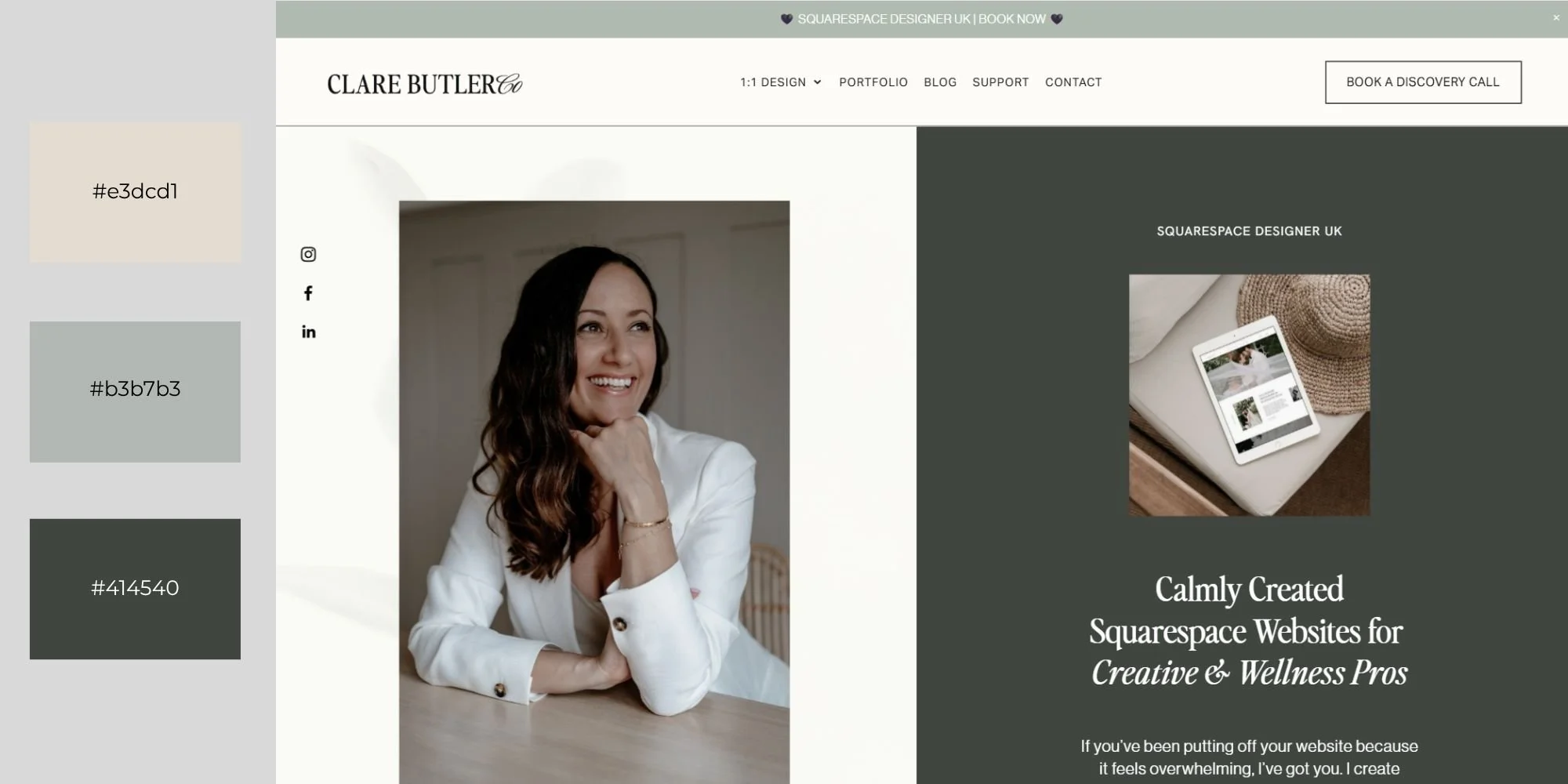
Source: Clare Butler
2. Bold & Modern - Huemor
Huemor, a creative agency, leans into deep black backgrounds with bright green and purple accents for a bold, high-impact look. This kind of contrast grabs attention immediately and keeps users engaged as they scroll. It’s the visual equivalent of saying, “We think differently”—perfect for brands that want to lead with personality and edge.

Source: Huemor
3. Earthy Tones - Rose Benedict
Rose Benedict Design, a creative studio that showcases deep olive greens, terracotta, and warm beige tones throughout their site. The palette feels warm and organic but still sophisticated. It reflects a brand that’s connected to nature without sacrificing clarity or professionalism, and it’s a great match for creative businesses with a grounded mission.
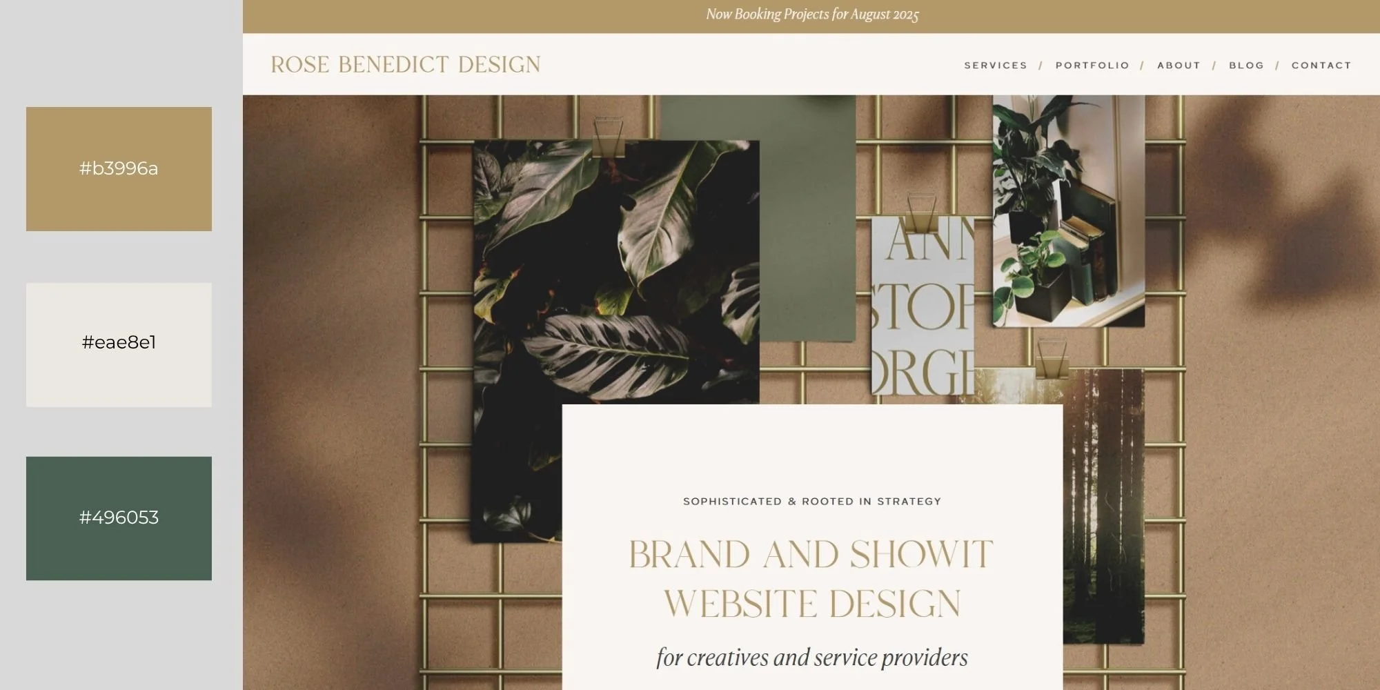
Source: Rose Benedict Design
4. Pastel Dream - Magic Spoon
Magic Spoon brings cereal branding into the modern era with playful pastel blues, purples, and pinks. The vibe is fun and nostalgic without feeling juvenile. Everything from the packaging to the site design taps into a feeling of joy and comfort, proving that pastels can work beautifully when paired with confident, clean design choices.
If you're exploring seasonal refresh ideas or softer tones for your brand, you might love the summer color palette inspiration I pulled together in this post. It's full of warm-weather combos that still feel on-brand year-round.

Source: Magic Spoon
5. Monochrome with a Pop - Redbrick
For a bold take on monochrome using red, look at Redbrick Coffee. Their website leans into a full range of reds—from muted cranberry to vibrant scarlet—with minimal distraction from other hues. The result is warm, cohesive, and full of personality. It's a strong reminder that a single hue, when handled thoughtfully, can create depth, emotion, and brand consistency without needing a bunch of accent colors.
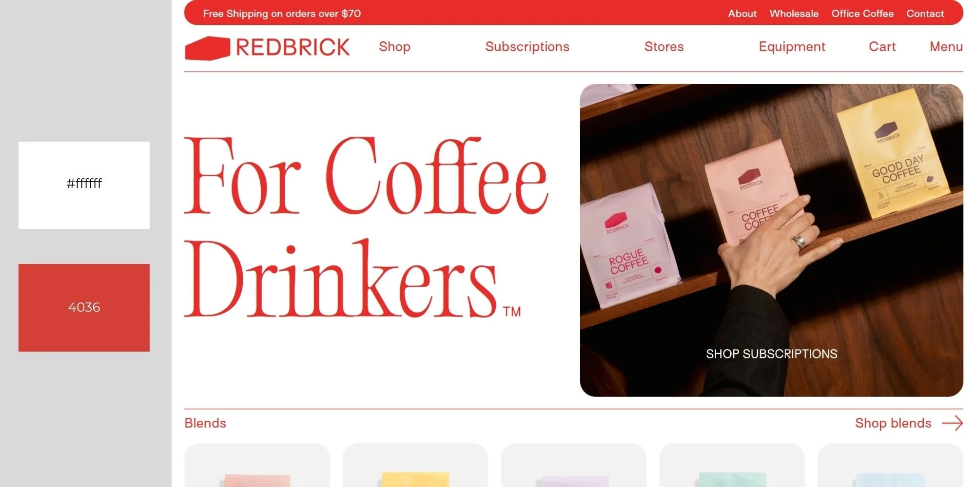
Source: Redbrick
6. Coastal Fresh - Swab The World
Swab The World, a nonprofit organization focused on global health, uses soft blues and greens to establish a clean and trustworthy digital presence. The colors evoke clarity and calm while remaining approachable. This is a great reminder that color can do a lot of emotional work for your brand when chosen with intention.

Source: Swab The World
7. Tech Luxe - Semrush
Semrush, a well-known SaaS brand, opts for a bold palette of purple, green, and orange—a surprising trio that stands out in a sea of tech blues and grays. The colors add energy and make the interface more engaging, all while keeping the brand looking sharp and professional.

Source: Semrush
8. Bright and Playful - Hextaburger
Huxtaburger’s website embraces bold red and yellow tones paired with cream for a punchy, fast-food-meets-street-style aesthetic. The palette instantly signals fun, flavor, and a laid-back vibe. It’s a perfect match for a brand that doesn’t take itself too seriously but still wants to be memorable.

Source: Hextaburger
9. Pastel Artisanal - Aura Bora
Aura Bora, a sparkling water brand, uses pastel accents like mint and soft yellow to create a whimsical, handcrafted feel. These gentle tones reflect the brand’s quirky personality and botanical ingredients, proving that color can reinforce both visual identity and product ethos in a subtle yet powerful way.

Source: Aura Bora
10. High-Energy Gradient - Sarah Guo
Venture capital investor Sarah Guo’s site features a smooth gradient blend of blue, purple, pink, and mint. The effect is modern and calm-energetic without being chaotic. Subtle color cues, like a gradient cursor and section overlays, add a layer of interactive sophistication
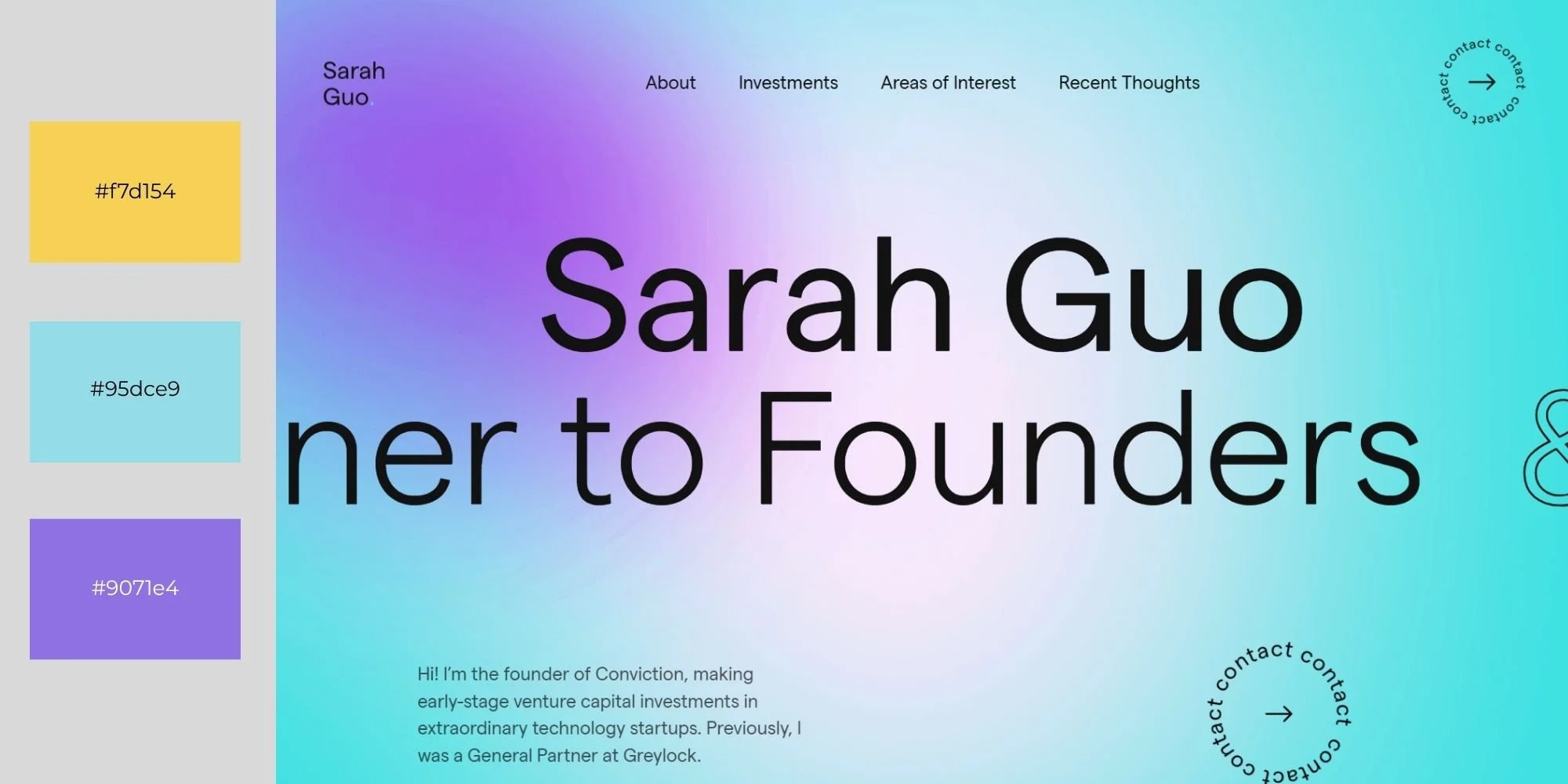
Source: Sarah Guo
If you’re not sure about what your colors are saying about your brand? Take a look at The Psychology of Color in Web Design. It breaks down how different hues influence user behavior, and it’s especially helpful if you're doing your own branding and want every color choice to be intentional.
How to Apply a Color Palette to Your Squarespace Site
Once you’ve picked your brand colors, the next step is getting them set up in your actual Squarespace site. This part trips up a lot of folks, not because it’s hard, but because it’s easy to miss where each color should go for maximum impact.
Here’s how to make your palette work with your Squarespace template, not against it.
Step 1: Open Site Styles
Click the paintbrush icon in the top-right corner of your Squarespace site editor. This opens the Site Styles panel, where you can customize fonts, buttons, and (you guessed it) your color palette. Head to the Colors section to begin editing.
Step 2: Apply Your Palette in the Right Order

The order you input your colors affects how Squarespace generates its 10 Color Themes, which are used throughout your site. To get the best results with the least manual adjusting later, apply your colors like this:
Top Left: Lightest color (your site’s “white” background)
Bottom Left: A lighter neutral (great for overlays or background variation)
Middle: Your accent or CTA color (used in links, buttons, and highlights)
Top Right: Secondary dark color (for contrast or subtle emphasis)
Bottom Right: Darkest color (your “black” for headings and body text)
Step 3: Test in Context
As you apply your palette, preview a page with real content like your style guide or homepage layout. This helps you catch any contrast issues or color clashes early on. Buttons should stand out, text should be easy to read, and overall everything should feel cohesive.
And if you’re using one of my Squarespace templates, you’re in luck! All of them include a built-in style guide page designed specifically to help you preview, test, and refine your colors in real context. It’s the fastest way to make confident design decisions without guesswork.
Step 4: Let Squarespace Do the Heavy Lifting
Squarespace will auto-generate Color Themes based on your inputs. These are applied across different sections, so be sure to test how they look using the style guide page included in your template. This makes it easy to see how each Color Theme behaves without changing settings section-by-section.
Once your palette looks solid and your design feels aligned with your brand, you’re ready to build out the rest of your site without constantly second-guessing your color choices.

Final Thought
The right palette can do the heavy lifting when you're trying to build something that feels as good as it looks. And if you’re wondering how to choose color combinations for your website, bookmark this guide.
Ready to put these color strategies into action? If you need help implementing these principles or want to work with professionally designed templates that already incorporate these psychological color strategies, check out my template shop or consider my custom website design services.
Your website should work as hard as you do, and the right color palette is often the difference between a site that just looks pretty and one that actually grows your business.
Ready to build an eye-catching website that perfectly captures your ideal customers and represents your brand?
Check out our collections of premium Squarespace Website Templates today and start your journey toward creating an impactful web presence! Click the link below to explore one of our designs.


Just a heads-up: This post may contain affiliate links. That means if you click on one of those shiny links and make a purchase, I might earn a small commission – at no extra cost to you! Think of it as you buying me a coffee ☕for sharing these fantastic finds with you. It helps keep the blog lights on and the content flowing! So, while you’re here, feel free to enjoy the recommendations and know that your support means the world to me.